
Maravilla Cafe
Education
Innovation
Customer Satisfaction

When it came to the identity system they wanted to go towards a friendly approach. A typography that’s a rounded sans-serif. There were many iterations at the beginning where the logo included the word “Café”, but in the end it was removed to make it simplistic.
The colors were picked in children in mind. As well as inspired by Mexican culture of using bright colors. Bright colors are used throughout the culture for celebrations and to give a lively approach.
As mentioned, the typography used was to give off a friendly approach, a text that is easy to read for the logo. Throughout the project I used a lot of typography. To list the typography used is from Adobe Fonts. The list includes, Gambado Sans (Forte), Agenda (regular), and Charcuterie Deco (regular). Gambado is used for subtitles, agenda is used for text, and Charcuterie is used for titles.

I started with the mural, I started off with a lot of details, it felt like some of them were not needed. For example, the leaves were part of the original design. Some of the colors seemed like they could bleed or make it harder to see what animals which were. So, I had made a couple of iterations (like color changes, and moving stuff around, removing unnecessary details) before it finally came together, added with text.

For social media, I had chosen Instagram stories. Each story uses a combine of colors, and text that welcomes the children to learn, explore, and enjoy the atmosphere of the restaurant. When creating these I had the animals together but I changed it so it was easier to read while combining the paint stroke in the background.

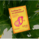
The client wanted 3 cards that used illustrations and colors to advertise the restaurant and what is all at the restaurant. It was rough due to wanting to add a border, but colors weren’t contrasting correctly. The card had a menu connected to it, but in the new iterations of the design the menu is a separate design. In the end the colors worked and contrasted a lot better than before.
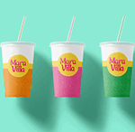
There are 3 sets of cup designs. They work coherently without adding too many details to the design. In early irritations there were more colors and I was having a rough time with the combinations of the colors but in the end it was a easy design with patterns and logo placement.
These are the mockups. They show the different ways the designs are shown. Through the different set ups and how it would be displayed.


